Fermata Circle
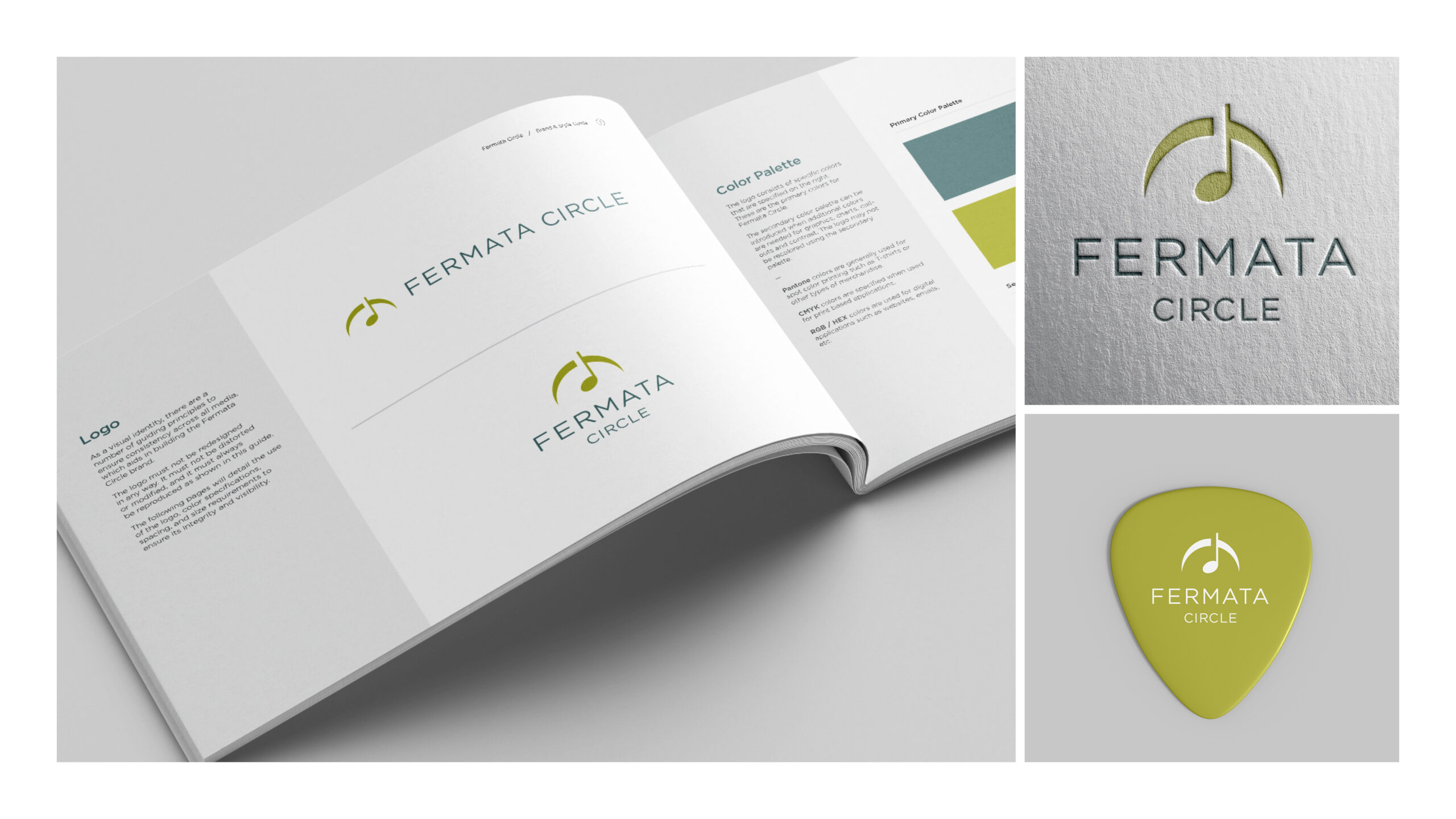
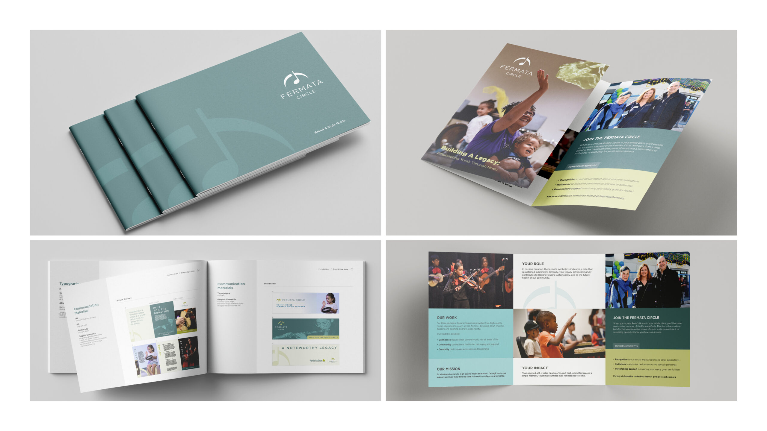
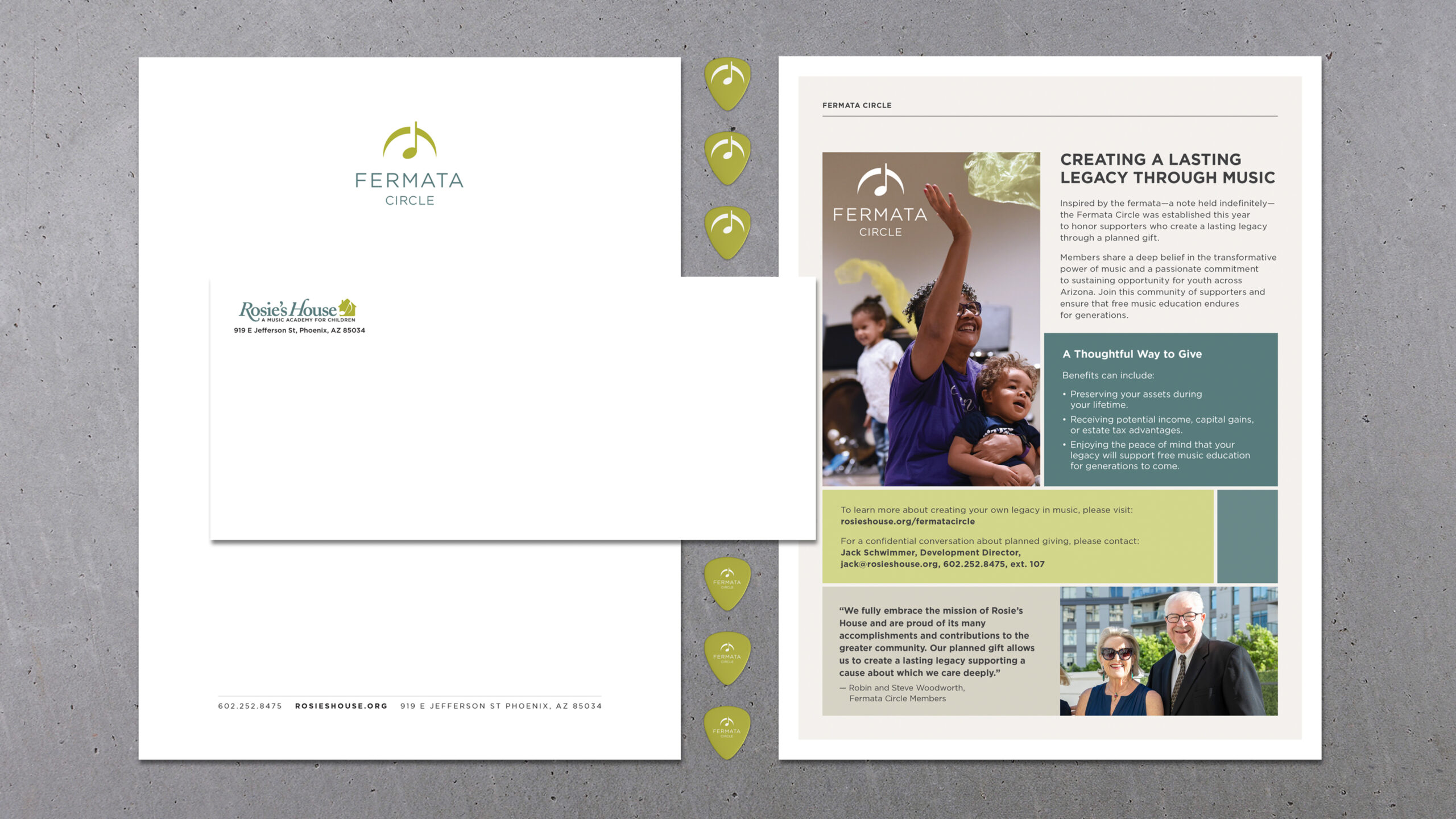
Rosie’s House started a new planned giving initiative in 2025 that was designed to connect with donors seeking to give long-term financial gifts beyond their lifetime. They wanted a brand identity that was visually related to their nonprofit organization, Rosie’s House, and wanted it to communicate longevity and connection. Their organization is the largest free music education program in the country for pre-K to grade 12 so the first place I looked during the research phase was music culture. During the design process, I specifically looked at musical iconography and language to help inform the solution. I discovered the fermata (𝄐), a musical notation symbol that tells a performer to hold or sustain a note, chord or rest for longer than its standard written duration. This felt like the perfect solution that would give it depth and relate directly to the goals, an organization with meaning. After many iterations I came up with adding an eighth note to the symbol and stylizing it to resemble the Rosie’s House logo, which also includes musical notation on the logo mark. They rolled out the brand and program over the last year and have already used it to add to their donor list. Deliverables included a logo package, brand and style guide, letterhead, email signature, brochures and concepts for promotion items.